
Renaud Parent - Full Stack Developer
The Post is a central object in the InUse business app. It is the way for machines to communicate directly with the users, and for users to interact. It can even be used to input data manually. Over the last five years, we progressively enriched it to increase the interaction possibilities, and added more and more features to it, in order to fit with the various – and sometimes very different – use cases we want to cover in the application.
Today a post can have a status (e.g open or closed), it can be assigned to users and planned in time, it includes also tags, work instructions, comments, links to data visualizations, etc. It is now even possible to group posts in threads. All those improvements were implemented based on our vision, and from the customer needs and feedbacks over the years, and led to a wide adoption (over 4.5 million posts created as of today).
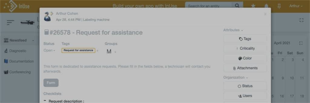
However, increasing the capabilities of the post also made it a more and more complex object : to create a post, the user was provided a form with no less than 12 fields, which can seem a lot even if most of them are optional. And when opening a post, the user was given many information and action buttons, dispatched on various locations in the page, that were not always relevant according to the post’s purpose.
So we decided to rethink the post ergonomy entirely, with this question in mind : how to keep it as simple and easy to read as it should be, while keeping it rich and powerful ?
When we look at how our customers use posts, we can see very different use cases for posts. We identified three main kinds of posts : ticketing posts, automatic alerts and reports.
In order to facilitate the user experience, each type of post has its own applicable status which is customizable by the user to best fit the type of post. Besides the simple title and body that are always required, other attributes are clearly not useful for all three kinds.
Most of our equipment manufacturers’ customers use the posts as a ticketing system to interact with their customers. Incident reports, intervention vouchers, planned maintenance instructions… For this kind of posts (tickets), the following attributes are essential :
Automatic alerts are posts from machines generated automatically to alert the users about a dysfunctional behaviour. In this kind of post you might not need planning and assignation attributes, at least not when the alert is generated. The status might or might not be useful depending on your workflow (e.g. you may want to create a related ticket from this automatic alert to start working on the resolution).
On the other hand, you may need to insert real-time values from the machine in the post to give more information about its state when the alert was triggered, or even a link to data visualizations like snaps centered on the time at which the failure occurred, to help investigate this alert.
Another widespread usage of the posts is the automatic generation of production reports (e.g. daily or weekly reports). This is very useful to summarize key performance indicators for a given period, and to display some static data visualizations illustrating these figures. Reports are purely informational, and do not need a lot of interactions (besides comments and feedbacks). Generally status makes no sense here, neither does criticality, and every work organization attributes. Those posts are meant to be just read and exported to pdf.
Based on this analysis, we decided to reshape the post entirely.
The first idea is that, instead of showing every available attribute or functionality, we want to show the default post as a very simple object : a title, a body. That’s it. Just like an email. If you need one or several more evolved attributes to enrich it, then you add them by yourself, and only those attributes will be visible.
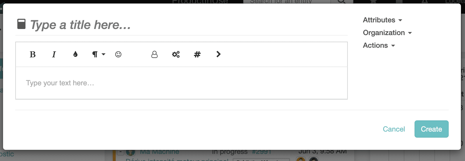
This is not user friendly nor intuitive, you don’t see the result of what you are editing before saving and going back to the reading view. Instead, the post now has a unique view, with every field editable by simple click.
And lastly, we wanted to rationalize how the post layout is organized and how users interact with it.
Now, let’s see how we solved this!
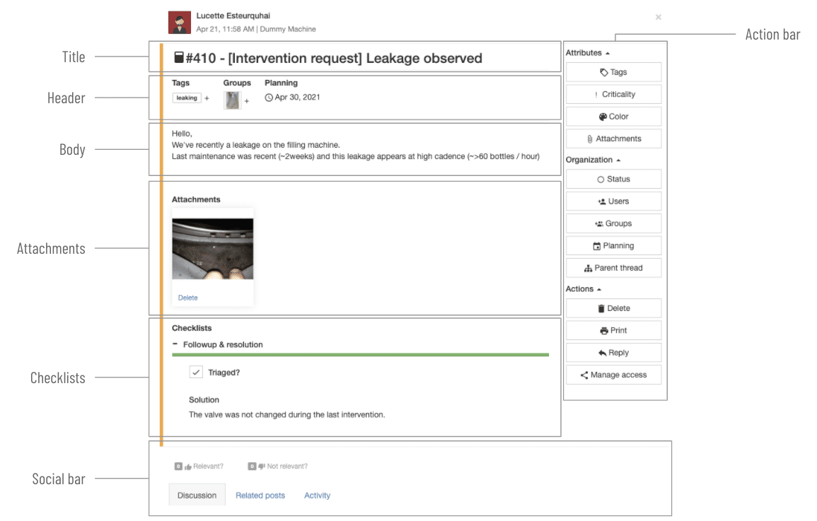
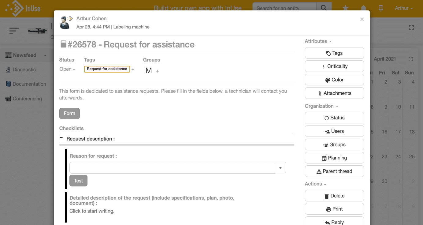
The post is now splitted in two columns: one for the content display, and one for the actions.
Several editable attributes have been grouped in the header bar (tags, assignees, thread, planning & status). They are displayed in this bar only if they have been set.
The action bar is splitted in three sections:
As you can see, we also put some attention on making the general appearance lighter. There is much less lost space in the new layout, and also less borders. Of course, as we are aware that more and more users use posts on mobile devices, this layout is fully responsive: in particular, the action bar column turns into an action bar line on smaller screens.
Last but not least, opened posts are now displayed in a “frame” above the current page instead of having their dedicated pages. This is very convenient to keep the current context instead of being automatically redirected to the machine linked to this post. For example, if you open a post from a newsfeed at a Site level, you will stay on this page when you close the post. As you might already know, links to posts can also be inserted in Synoptics, and this new behaviour will prevent from leaving the Synoptic when clicking on one of those links.
We can’t wait to hear your feedbacks on this brand new layout, and we feel confident that it will improve your understanding and usage of the post in the application. It will be available in the new layout of the application.
Related News