
Emeline Lage - Product Manager
Retrieving information is an issue at all levels and a graph is sometimes better than a long report.
The DIKW* pyramid model outline the need for data transformation for its exploitation. Additionally, it is important for each level, to know how to represent the data for a straightforward and easy interpretation. A good visualization speeds up the understanding of the situation, targets critical information and facilitate the decision process.
* DIKW : Data, Information, Knowledge, Wisdom Pyramid
For many years, data visualization tools have been standardized, with the same well-ordered canvas, bar, line graphs or classic camemberts. This is the effect of business intelligence where Excel is a democratized and generalized experience.
However if this type of experience is suitable for finance or top management, it is much less suitable for field users. Between a graphic and a written word, our brain will instantly and effortlessly understand a visual medium rather than a succession of written information.
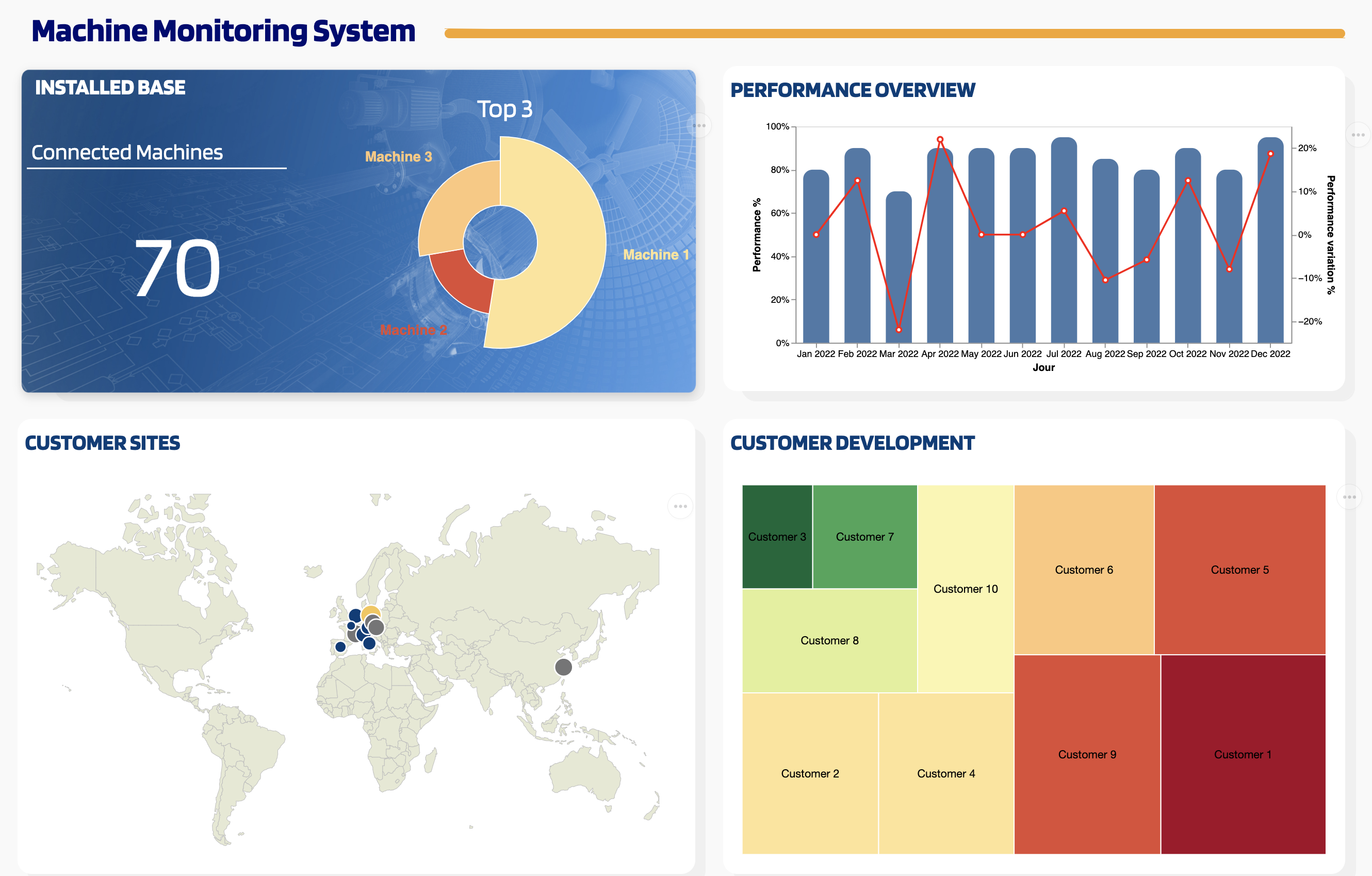
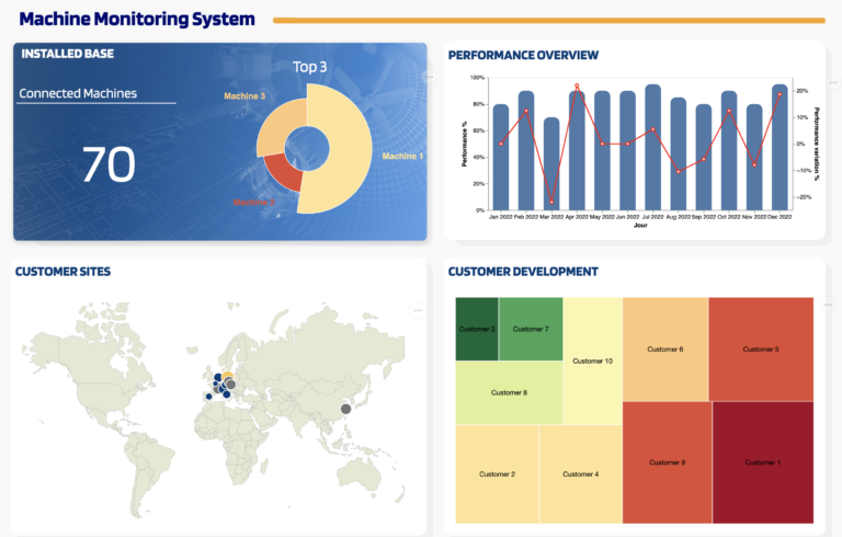
InUse takes up with its customers the challenge of transforming raw and complex information into quality visuals: the rendering becomes simple, ergonomic and graphic.
When deploying a digital service, the final step is gathering and making sense of raw data on simple, decipherable visual media at a glance.
InUse offers an editor, as simple as PowerPoint, allowing to add in a few clicks visual components (image, text), connected and aggregated data: synoptic views. The interface is thus customizable to best meet the needs of customers.
Generic, reusable, and/or contextualize, this tool provides flexibility and saves time in the implementation of supervisory tools and decision support.
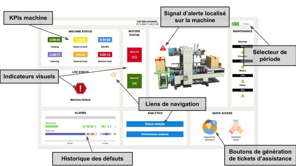
Since ergonomics is an important topic to ensure adoption, the "Synoptics" tool provides visuals while being interactive with navigation and content creation elements (configuration sheet, incident report, spare part order).
We can find images, links, KPIs or more complex visualizations. They can be created independently or by consulting our library of pre-configured visualizations, available to find inspiration.
This modern and less austere tool will not only seduce a new connected generation of operators and technicians but also promote their skills.
This solution allows enriched and explicit information restitution, enabling operators to remove any ambiguity during data interpretation. The desired information is visually located on the equipment or line concerned (breakdown, KPI,..) and allows access at a glance and with precision to the latest events at a glance.
To go further: saving time in research and analysis of information means shortening the time between information and action and thus promoting efficiency and performance.
Related News