
Guillaume Thomas - CTO
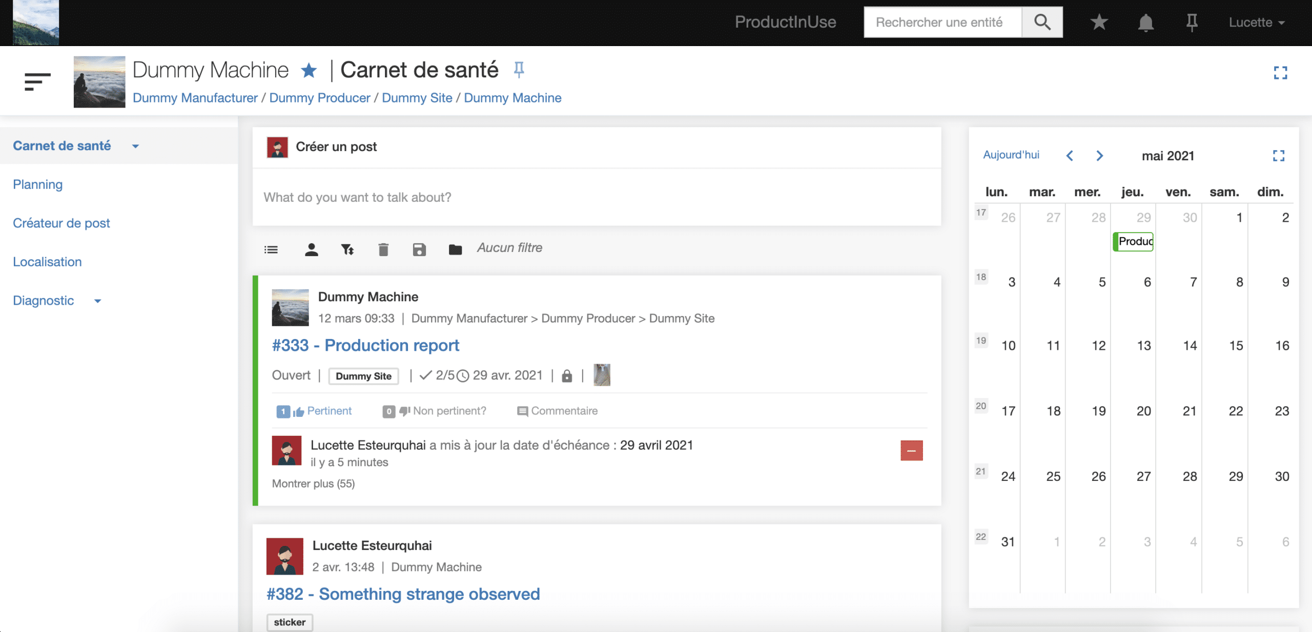
One of InUse’s key feature is the capability to build you own web application on which you’ll be able to deliver digital services like predictive maintenance or production optimization. As the application is used either by your teams and/or your customers, we know that customization is key and you have high expectations in terms of design. That’s why it’s already possible today to propose an application aligned with your visual identity where the name, logo, colors, icons are fully customizable as well as the content of each page.
Recently, we’ve had many feedbacks and ideas on how the appearance could be improved. It’s been a while since the layout has changed and we felt it was the moment for a full facelift. We’ve worked hard to make it more modern, cleaner and more intuitive. We believe that the more appealing the application is, the more your collaborators and your customers will want to use it. Isn’t it the case for the personal applications we love to use every day?
As a reminder, the web application structure is based on the entity hierarchy (Manufacturer (you) > Customer > Factory > Line > Machine). Each node of this hierarchy has its own set of pages that can be of different types (Dashboard, Synoptic, Documentation, Newsfeed etc).
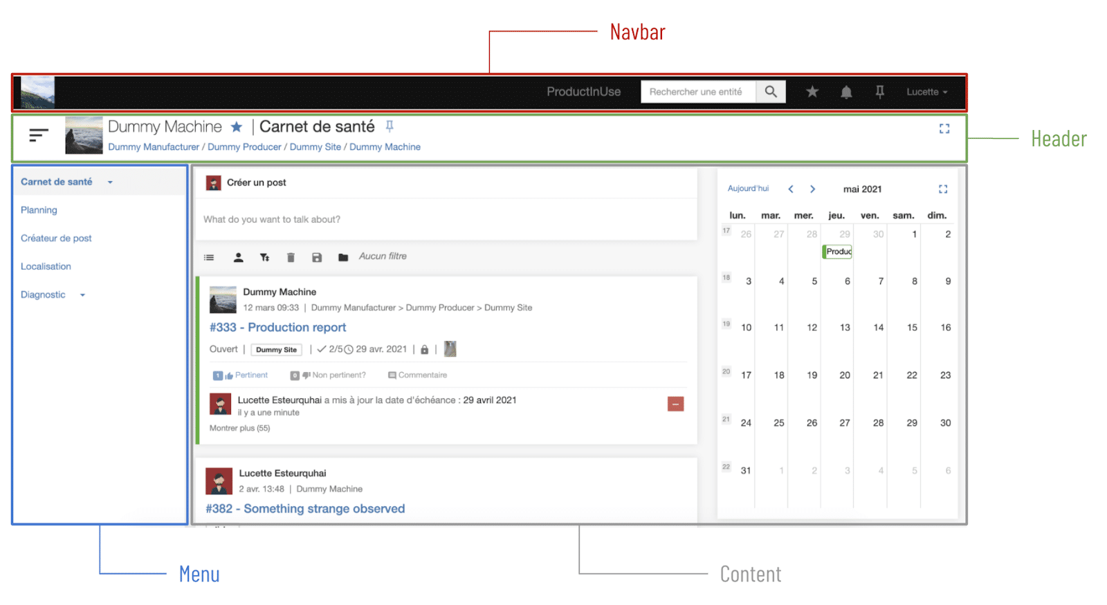
The global structure of the page has been reshaped to be more coherent. As illustrated below, it is composed of four parts:

As you can see, several things have changed. The left column has been removed and its components have been moved in several places:
This navigation bar has two goals:
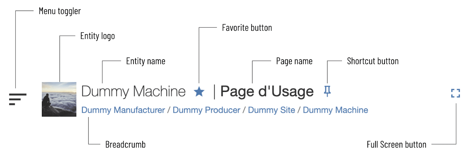
The header’s goal is to see at a glance on which page the user is. As the below image illustrates, it’s composed of several parts:

The menu
The menu is now vertical (versus lateral before) which is more standard nowadays. This avoids annoying horizontal scrolling and is more adapted to the new submenu capability which allows you to declare a page as a child of another one. It’s also togglable using the button in the header if you want to see the page content with full width.
The global design has been reshaped to give a more aerated impression:
What about mobile?
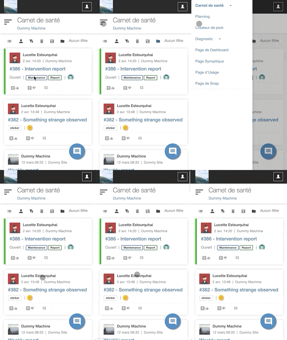
We see many users using the application with their mobile and sometimes in crucial moments like during an intervention. Thus, this new layout has been designed to be perfectly responsive. As the below image shows, the left menu now appears in a drawer, only essential information is displayed in the header and there is less blank space in the newsfeed.

Entering a new navigation experience can be sometimes destabilizing for some users, that’s why the deployment of this new layout will be progressive and will take place as follows :
Interested? Don’t hesitate to ask your customer success contact for a demonstration or further precisions.
Related News
